

Bridging human behavior and business strategy to engineer digital experiences that solve complex, real-world challenges.
7+ years of transforming operational bottlenecks into scalable, user-centric ecosystems for forward-thinking organizations.


A beautiful interface is just the start. True product design is a business tool engineered to solve real-world problems, eliminate friction, and drive sustainable revenue.
As an end-to-end strategic partner, I transform high-stakes concepts across SaaS, Government, and E-commerce into accessible, high-performing digital realities.
©2026
I engineer digital ecosystems that eliminate friction, elevate user experiences, and drive measurable business ROI.
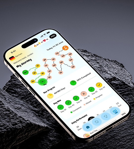
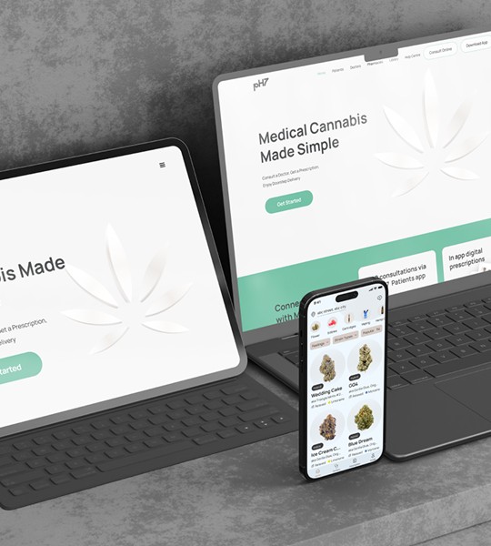
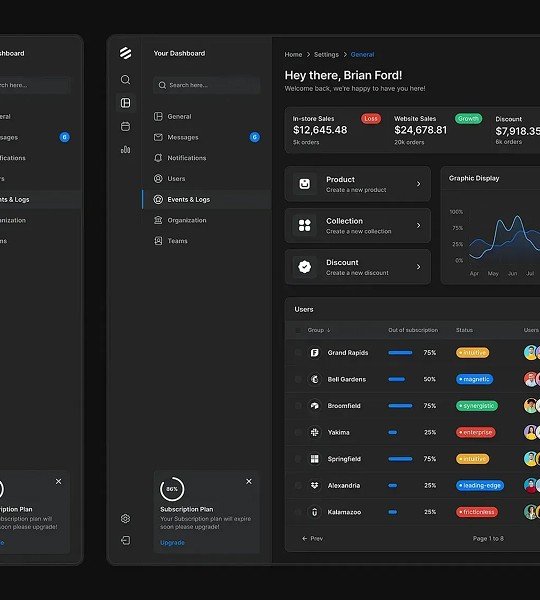
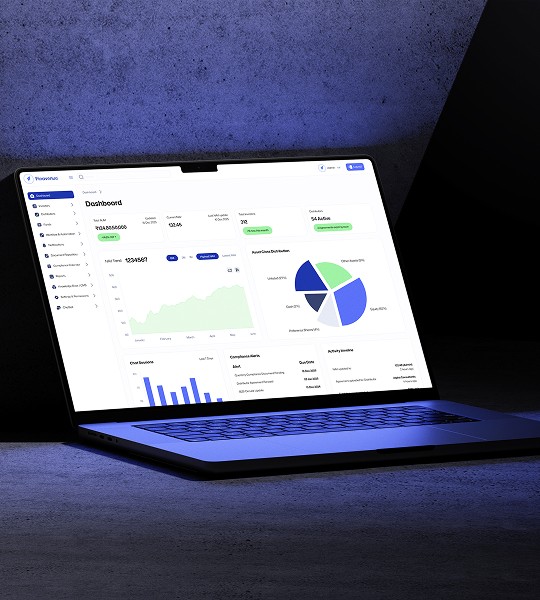

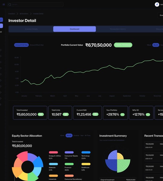
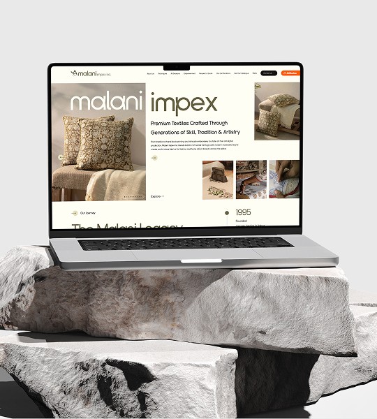
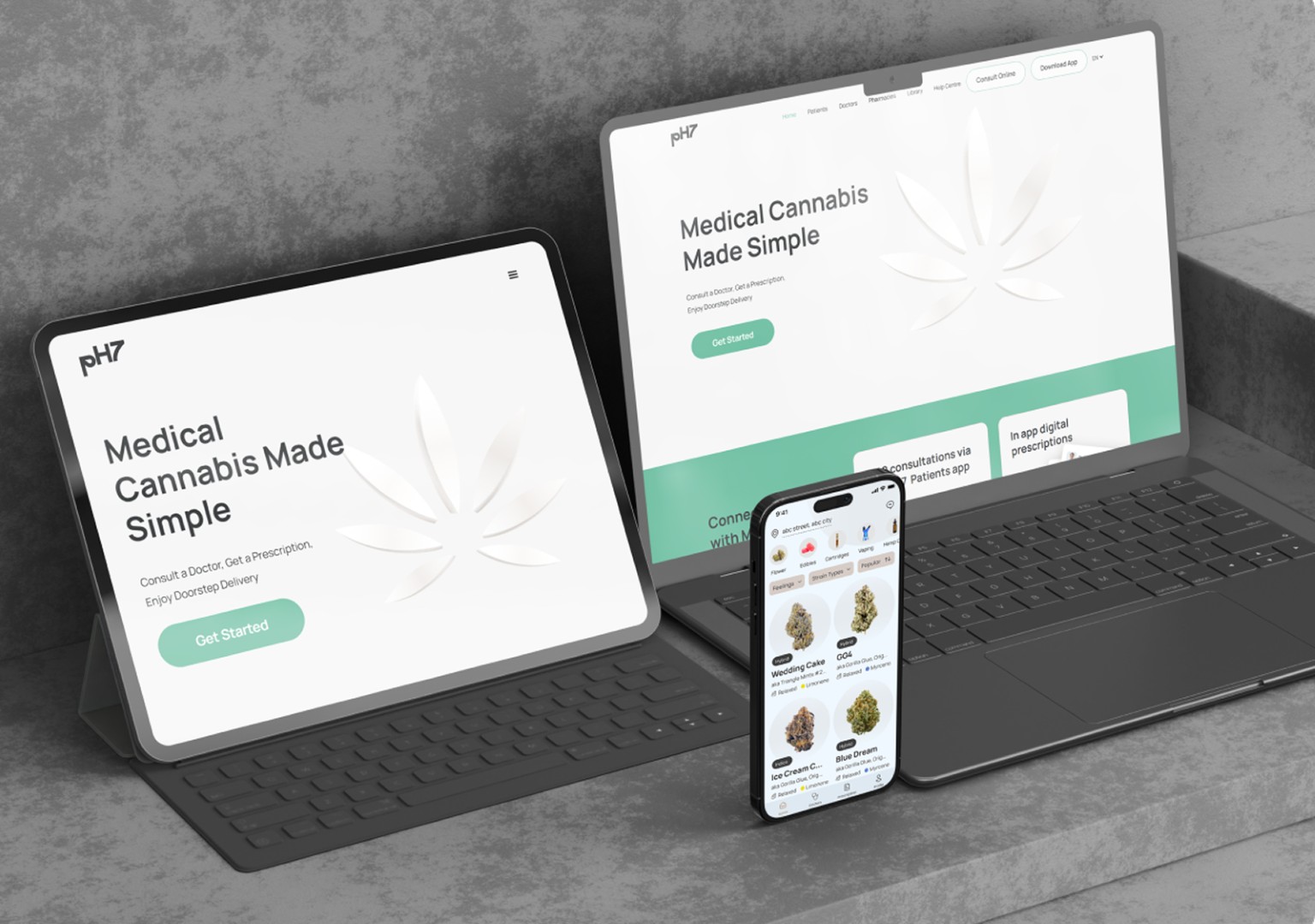
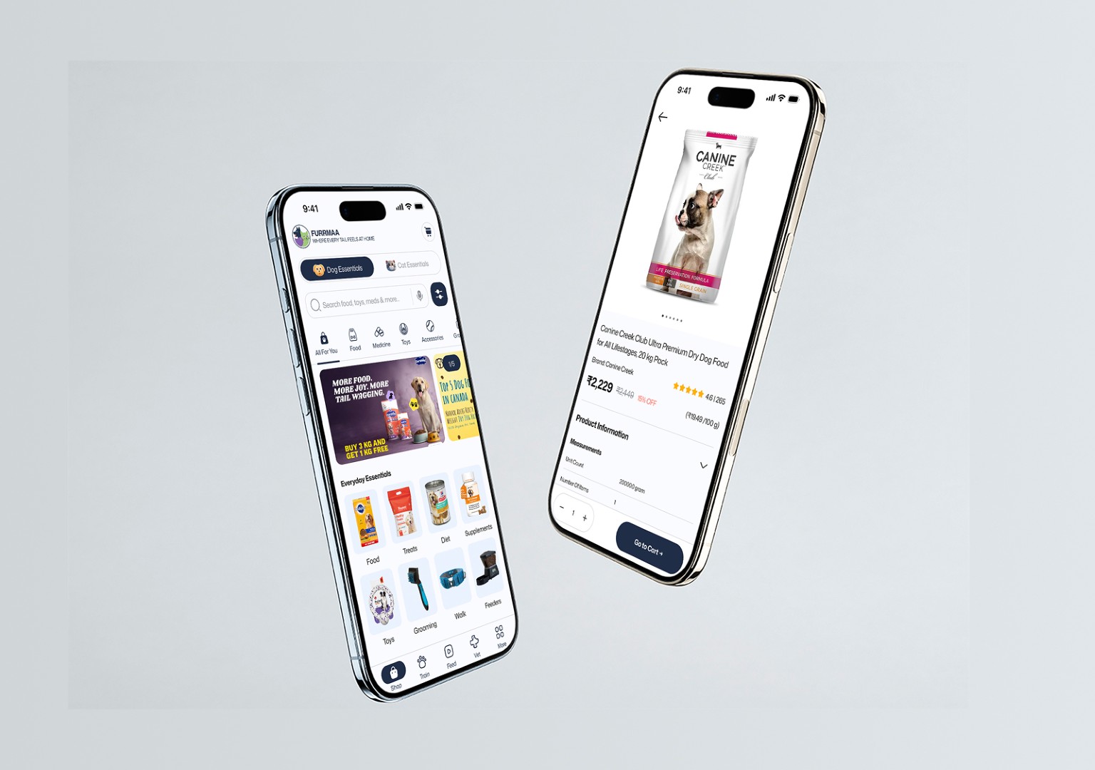
Platforms I've built, workflows I've streamlined, and strategies that delivered ROI.

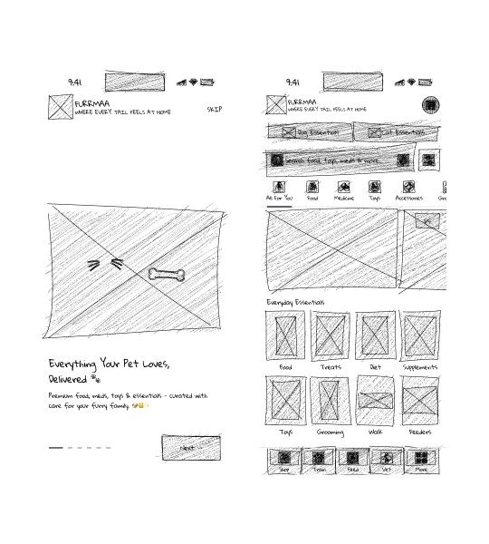
I start by mapping user behavior and business constraints. This deep analysis forms the strategic architecture and sets a precise foundation for the product.

Concepts evolve into intuitive, high-fidelity interfaces. I build robust, accessible design systems engineered for scale, usability, and seamless flow.

Bridging the gap between design and engineering. I ensure pixel-perfect handoffs so the final experience delivers flawless performance and lasting impact.


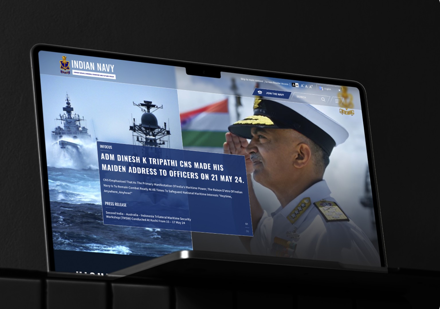
"Indra delivered a modern, intuitive digital experience that enhanced navigation and GIGW accessibility, making critical information instantly accessible to everyone."

"The end-to-end redesign of our platform resulted in a highly intuitive and visually stunning digital ecosystem that perfectly serves our diverse user base."

"A massive leap forward in user experience. Indra made complex content effortless to navigate, delivering a strategic design that perfectly reflects our brand."

"Working with Indra was a game-changer. His strategic design made the Teesas app highly intuitive, completely transforming how students interact with our content

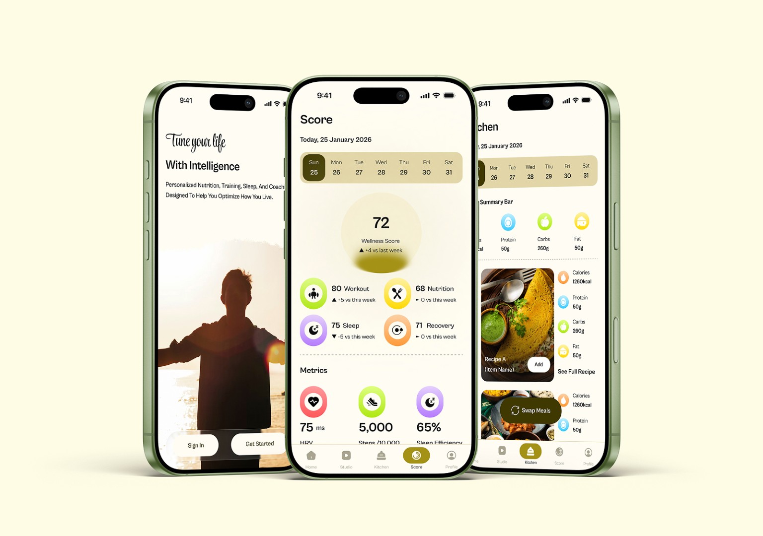
"Indra engineered a frictionless interface and fluid workflow. His UX/UI architecture made our platform vastly more accessible, making reducing food waste effortless for users."
I am a dedicated UX/UI partner focused on crafting intuitive digital platforms that elevate your brand and engage your users.

