All ProjectsWebsite Mobile Apps
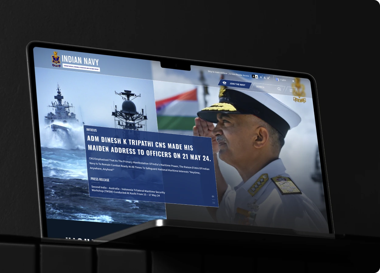
Indian Navy
Overview
Challenge: The Indian Navy’s official website was burdened with an outdated, non-responsive layout, making it hard for users—be it civilians seeking information or naval personnel accessing resources—to navigate
or find content efficiently across devices.
Solution: I reimagined the website with a modern, mobile-responsive design that streamlined navigation, improved content hierarchy, and adhered to WCAG accessibility standards—ensuring inclusivity and intuitive access
for all user types.
Impact: The redesign significantly boosted user engagement and content discoverability, creating a more dignified and seamless digital experience that reflects the prestige and discipline of the Indian Navy.
- Site Live indiannavy.gov.in
- Industry Defense and Security
- Sector Government - India
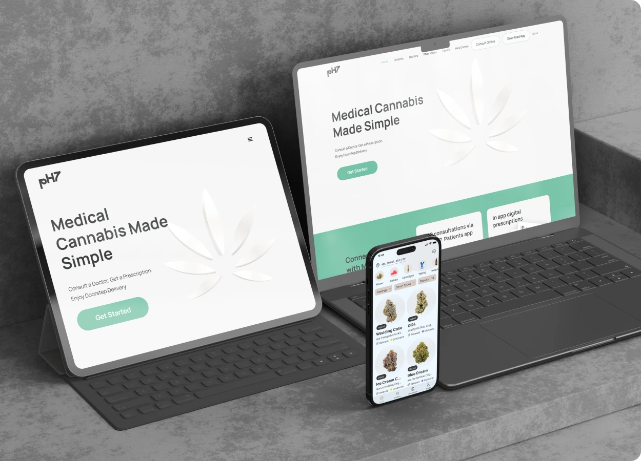

PH7 Health
Overview
Challenge: PH7 Health faced a fragmented digital ecosystem—patients, doctors, and pharmacy services were scattered across disconnected interfaces, leading to confusion, inefficiencies, and dropped consultations.
Solution: I designed a unified, cross-platform experience by streamlining the web portal and mobile apps for both doctors and patients. With intuitive UI flows and simplified navigation, the entire healthcare journey—from
booking to prescription—became cohesive and accessible.
Impact: The redesign led to faster consultations, seamless pharmacy coordination, and a noticeable rise in patient engagement and satisfaction—bridging the digital gap in modern healthcare delivery.
- Site Live ph7.health
- Patient App Store
- Doctor App Store
- pharmacy Live pharmacy.ph7.health
- Industry Healthcare
- Sector Private - UK
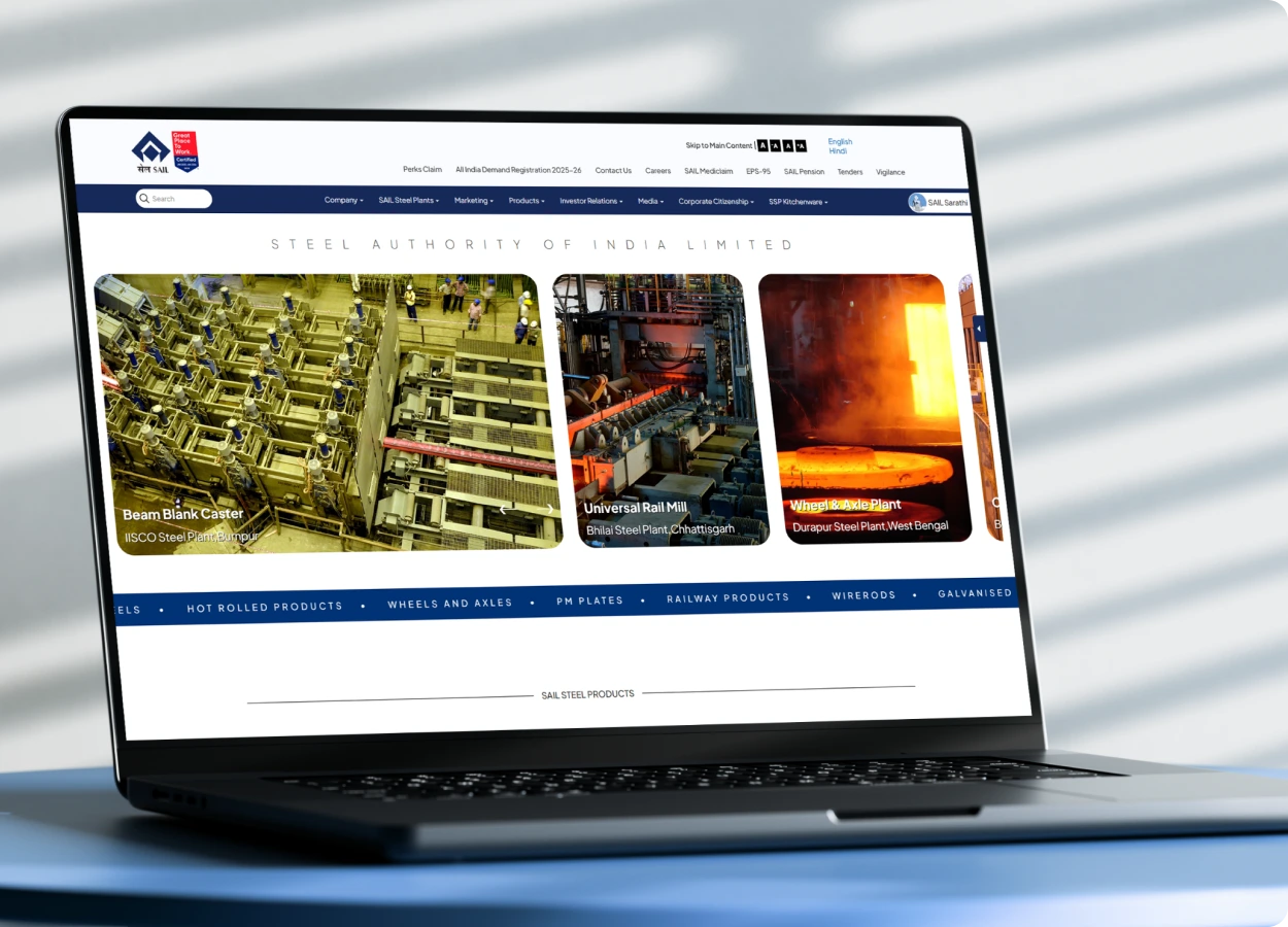
SAIL
Steel Authority of India Limited
Overview
Challenge: SAIL’s legacy website suffered from outdated design, inconsistent UI patterns, and poor mobile responsiveness—making it difficult for stakeholders, investors, and employees to access key information efficiently.
Solution: I led a full-scale redesign with responsive layouts, restructured content architecture, and a refined visual hierarchy. The new design brought clarity, consistency, and alignment with the brand’s industrial
strength and legacy.
Impact: The revamped platform enhanced stakeholder engagement, simplified access to both public and internal resources, and established a modern, credible digital presence that reflects SAIL’s national significance.
- Site Live sail.co.in
- Case Study Behnace
- Industry Steel Manufacturing (e-Commerce)
- Sector Government-India (Maharatna Public Sector)
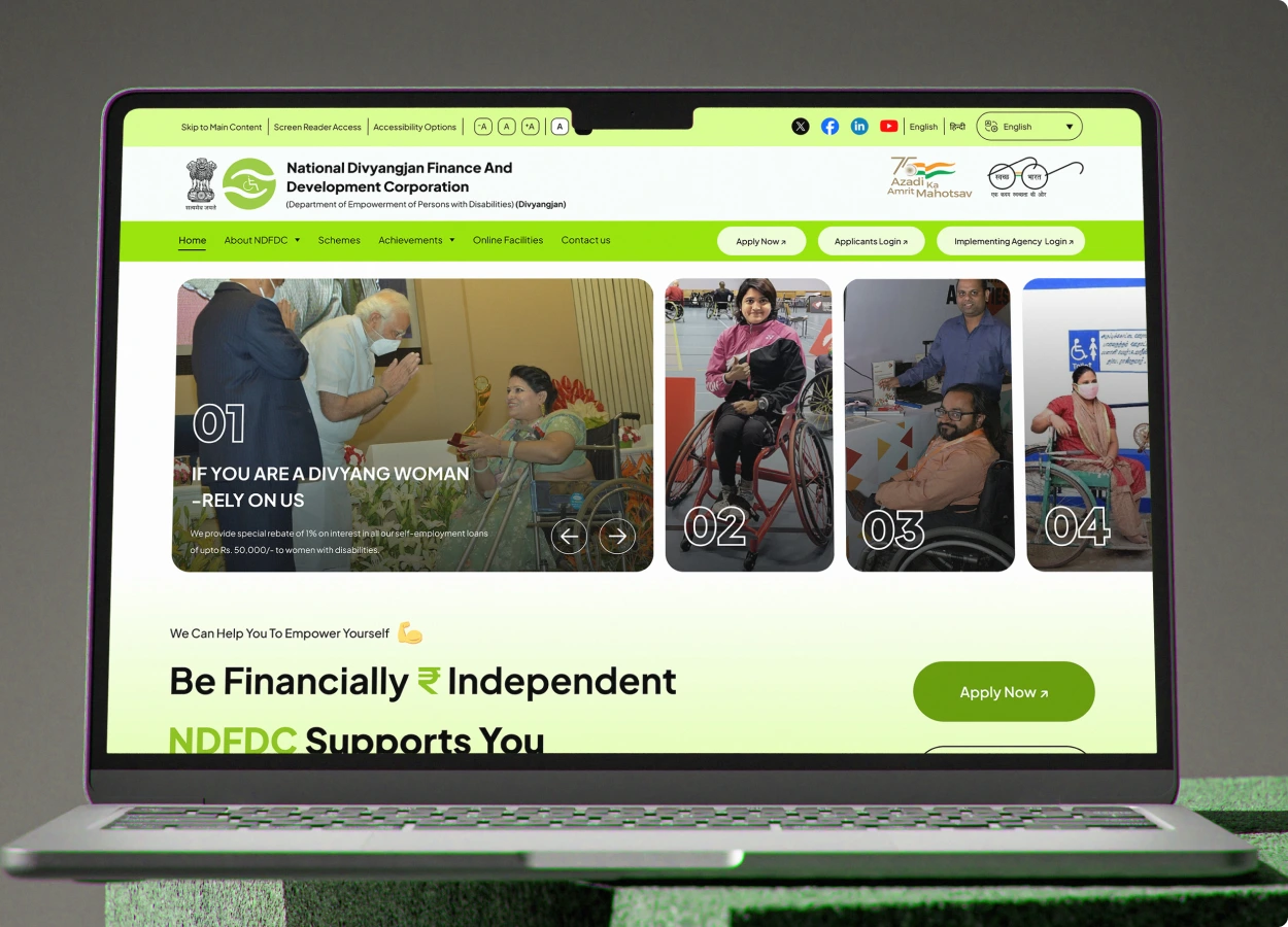
NDFDC
National Divyangjan Finance and Development Corporation
Overview
Challenge:The NDFDC website was plagued by outdated UI and lacked accessibility features, making it especially difficult for Divyangjan users and stakeholders to navigate, access information, or apply for loans online.
Solution: I crafted a fully responsive, GIGW and WCAG-compliant digital ecosystem tailored to the needs of Divyangjan users. The design ensured intuitive navigation, color-blind friendly contrast, and seamless flows
for public users, Admins, State Agencies, and Banks.
Impact: The redesign empowered users to independently apply for loans and access key services with confidence—resulting in higher accessibility, stronger user trust, and better alignment with inclusive government
standards.
- Site Live ndfdc.nic.in (In-Development)
- Design Figma
- Industry Social Welfare Financial Inclusion
- Sector Government-India (PSU, Ministry of Social Justice)
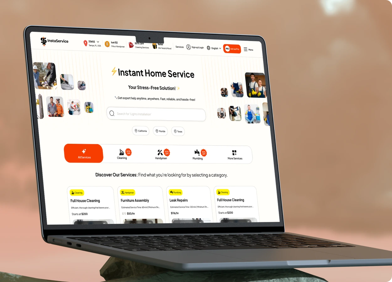
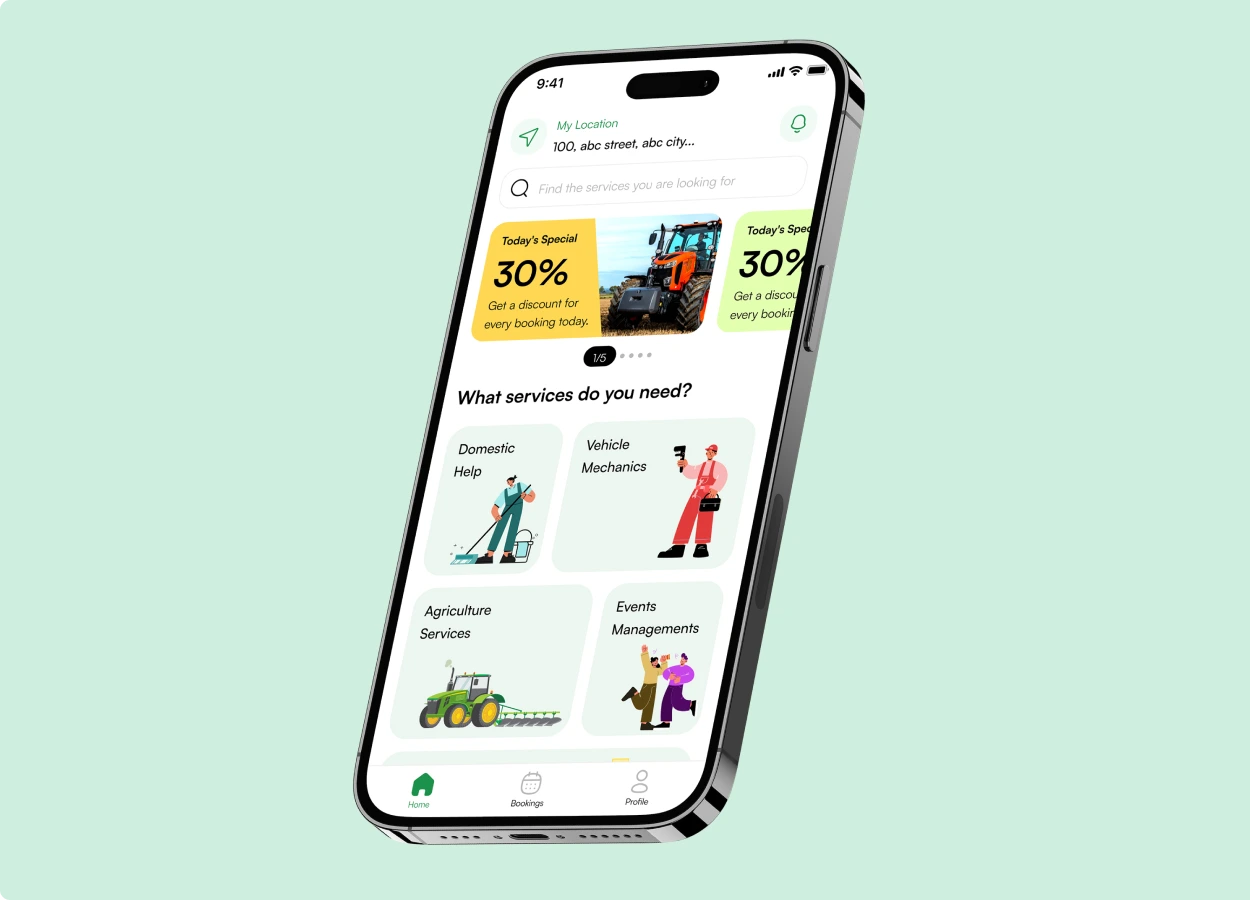
INSTA SERVICE
Overview
Challenge: Insta Service’s interface was cluttered and unintuitive, making it difficult for users to book services smoothly or track their requests—resulting in friction and drop-offs in the user journey.
Solution: I streamlined the entire experience with a simplified booking flow, added real-time service status updates, and introduced a clean, modern UI that guided users effortlessly from discovery to confirmation.
Impact: The redesign led to increased user adoption, faster booking conversions, and enhanced operational efficiency for service providers—delivering value across both ends of the platform.
- Site Live instaservice.com (In-Development)
- Industry On Demand Services(e-Commerce)
- Sector Private - US
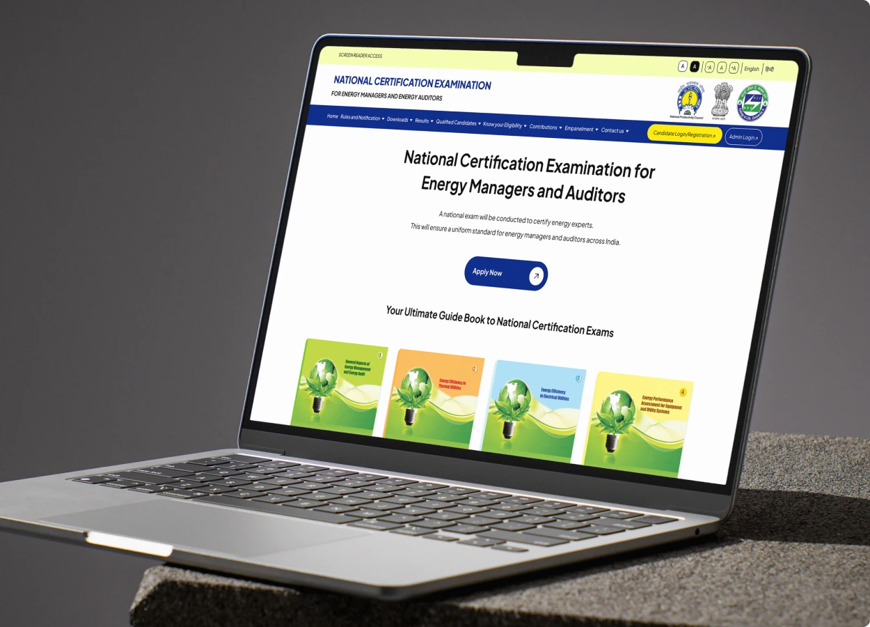
NATIONAL CERTIFICATION EXAMINATION
Overview
Challenge: The previous system was fragmented and difficult to navigate—lacking visual consistency and scalable workflows—making student registration, document handling, and departmental coordination inefficient
and error-prone.
Solution: I designed a unified digital platform that streamlined candidate registration, exam scheduling, and admin operations. The solution featured intuitive navigation, tailored admin dashboards, and automated
workflows for verification, document management, and progress tracking.
Impact: The redesign significantly reduced operational complexity and onboarding friction, enabling seamless collaboration between departments while improving overall usability for both students and administrators.
- Site Live aipnpc.com (In-Development)
- Design Figma
- Industry Education Technology Academic Administration
- Sector Government – India BEE Certification
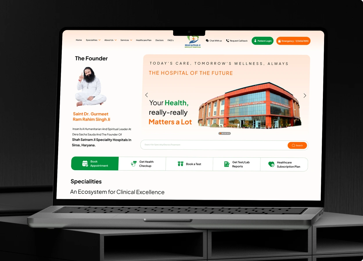
SHAH SATNAM JI HOSPITAL
Overview
Challenge: The previous hospital website lacked clarity, modern UX, and mobile responsiveness, which limited accessibility to critical services and appointment booking.
Solution: Designed a clean, trust-building web experience with streamlined appointment booking, service listings, and mobile-friendly navigation. Focused on making healthcare access intuitive and inclusive for both
new and returning patients.
Impact: Improved patient engagement, faster appointment scheduling, and increased user satisfaction through responsive design and intuitive information flow.
- Site Live ssjsh.com (In-Development)
- Design Figma
- Industry Healthcare Hospital Services
- Sector Private – India Community Healthcare Initiative
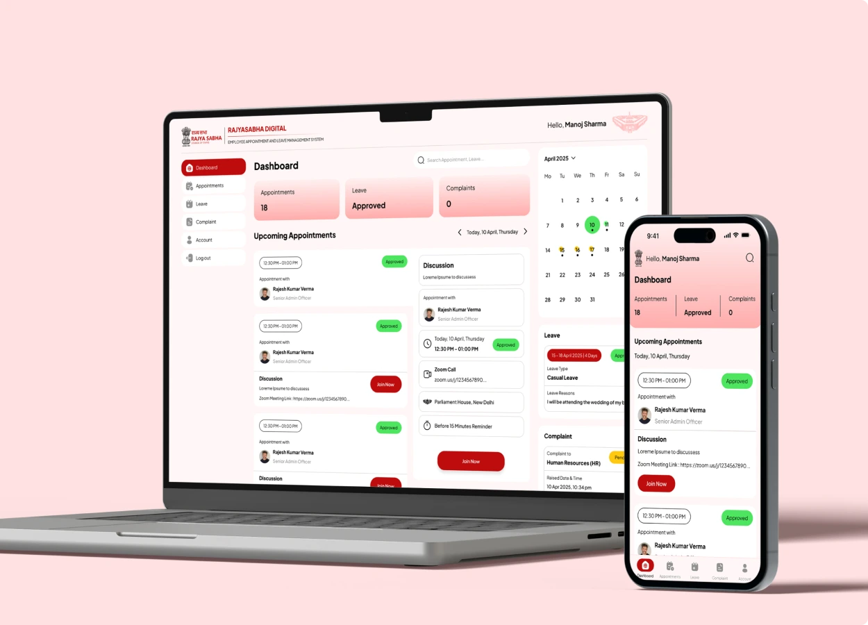
RAJYA SABHA
DIGITAL EMPLOYEE APPOINTMENT AND LEAVE MANAGEMENT SYSTEM
Overview
Challenge: Manual processes for employee scheduling, approvals, and leave tracking created inefficiencies and inconsistent reporting across departments.
Solution: Designed a centralized HR platform with mobile-first dashboards, real-time attendance, and role-based access control, streamlining workflows and improving internal operations.
Impact: Improved administrative efficiency, reduced approval delays, and delivered a smoother, more accessible HR experience for staff and officers.
- WEB - Design Figma (In-Development)
- App - Design Figma (In-Development)
- Industry e-Governance Government Workforce Management
- Sector Government–India Rajya Sabha Secretariat – Internal Operations
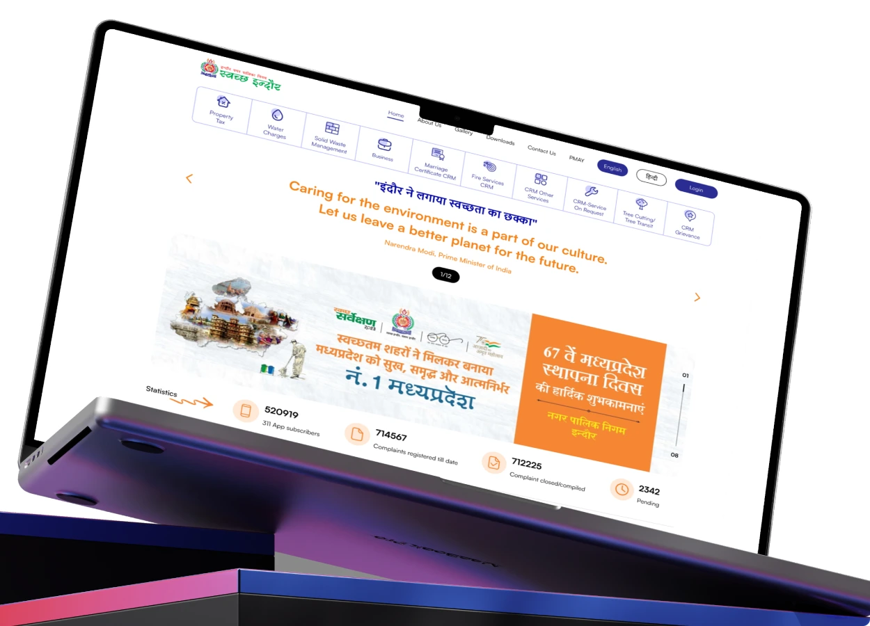
INDORE MUNICIPAL CORPORATION
Overview
Challenge: The previous city portal lacked visual clarity and functional consistency, making it difficult for citizens to access essential services and updates.
Solution: Designed a clean, civic-focused digital interface to showcase Smart City initiatives, service categories, and public updates—optimized for accessibility and ease of navigation.
Impact: Improved digital engagement, streamlined access to municipal services, and strengthened public trust and city transparency.
- Site Live imcindore.mp.gov.in (In-Development)
- Design Adobe XD
- Industry Urban GovernanceCivic Infrastructure
- Sector Government–India Smart Cities Mission
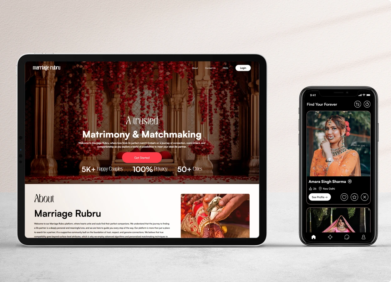
MARRIAGE RUBRU
Overview
Challenge: Traditional matchmaking platforms often lacked user-friendly design, cultural relevance, and intuitive filtering for diverse age groups.
Solution: Designed a minimal yet elegant platform with smart filtering, profile personalization, and guided user flows—prioritizing cultural inclusivity and ease of use for all age groups.
Impact: Enhanced browsing experience, increased time on platform, and improved user conversions through thoughtful UI and profile discovery mechanics.
- Site Live marriagerubru.com
- App Live Marriage Rubru
- Industry Matchmaking Social Networking
- Sector Private–India Community Platform
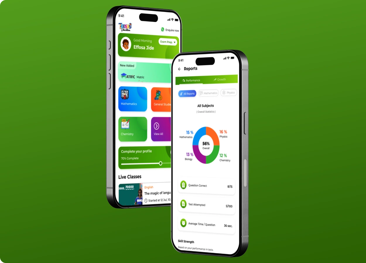
Teesas Education
Overview
Challenge: Teesas struggled with low user engagement and a disjointed UX that didn’t cater effectively to its wide learner base—ranging from young children to older students—resulting in high drop-off rates and limited
retention.
Solution: I redesigned the platform with a playful, age-appropriate UI and integrated gamified learning experiences—including interactive lesson screens, animated quizzes, and reward-based progress tracking. Each
feature was tailored to keep learners curious, motivated, and actively engaged.
Result: The gamified design led to a sharp rise in learner retention, better content accessibility across age groups, and a more delightful, intuitive educational journey—transforming Teesas into a more competitive
and engaging edtech product.
- Play Store Teesas Education - Learn
- Industry Education
- Sector Private-Nigeria (Africa)
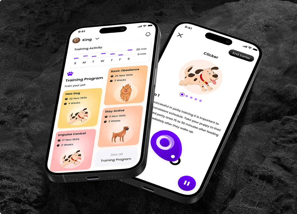
Hoofzy – Pet Training & Care App
Overview
Challenge: Hoofzy’s users—mostly pet parents—faced a confusing interface and lacked motivation to consistently engage with training modules, leading to poor app retention and underutilized features.
Solution: I redesigned the experience with a pet-first approach—introducing a calming UI, visual onboarding for new users, streak-based training progress, and gamified rewards to foster consistency and joy in daily
interactions.
Result: The redesign led to increased daily engagement, higher user retention, and a more intuitive, emotionally satisfying experience that helped pet owners stay consistent in their care and training routines.
- App Store (Live) Hoofzy
- Industry Petcare/Wellness/Training
- Sector Private–India
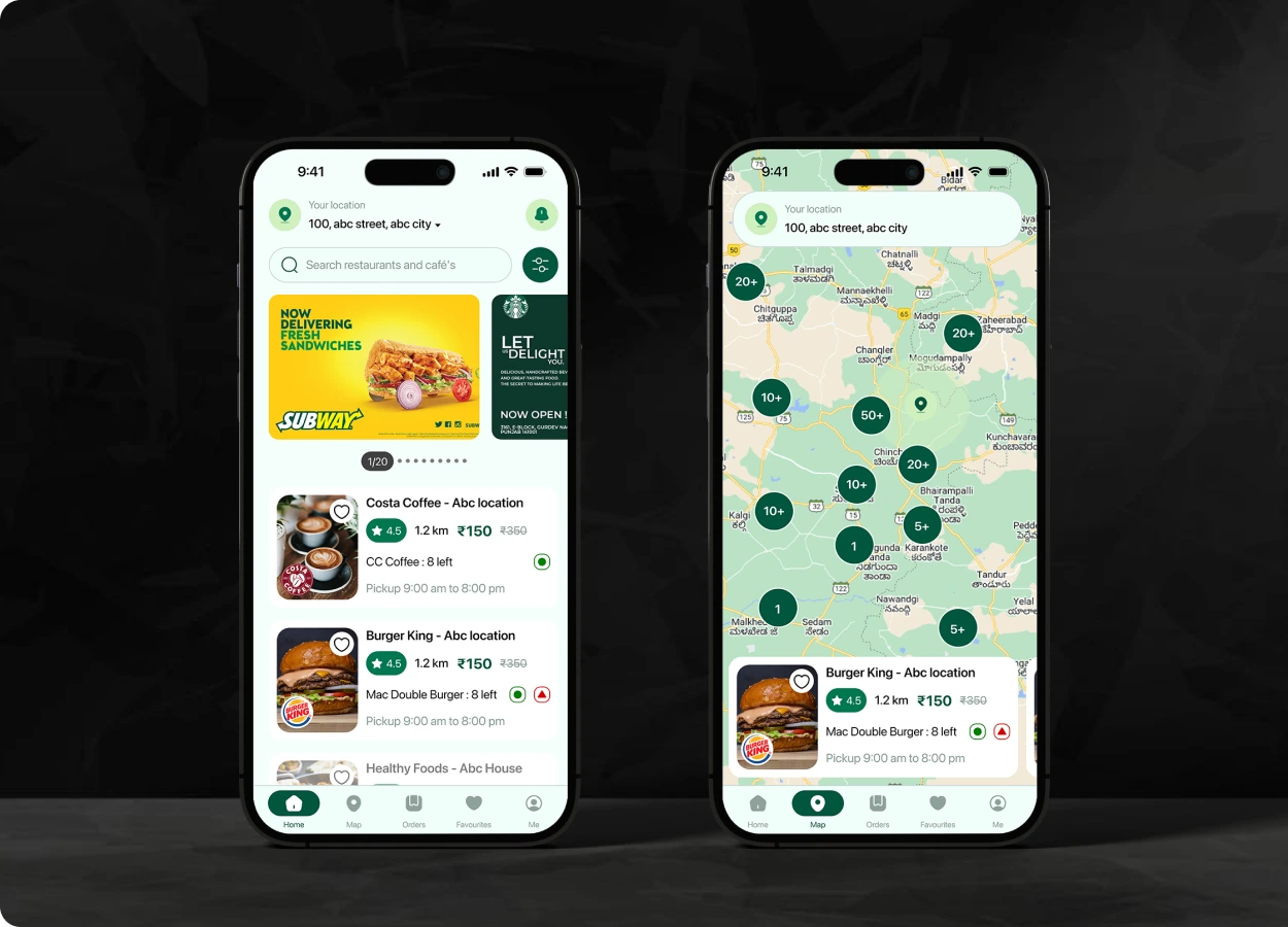

Good To Grab
Overview
Challenge: Good To Grab faced low user awareness and engagement due to a clunky interface that made discovering and ordering surplus food unintuitive—limiting its mission to reduce food waste.
Solution: I crafted a sleek, minimal app experience focused on effortless discovery and quick ordering. The design emphasized clarity, speed, and trust—making it easier for users to find, reserve, and enjoy surplus
food from nearby vendors.
Impact: The redesign empowered users to take mindful action, leading to a growing community that actively reduces food waste—while boosting app adoption, repeat usage, and vendor engagement.
- Play Store Good To Grab
- Industry Food-(e-Commerce)
- Sector Private-India
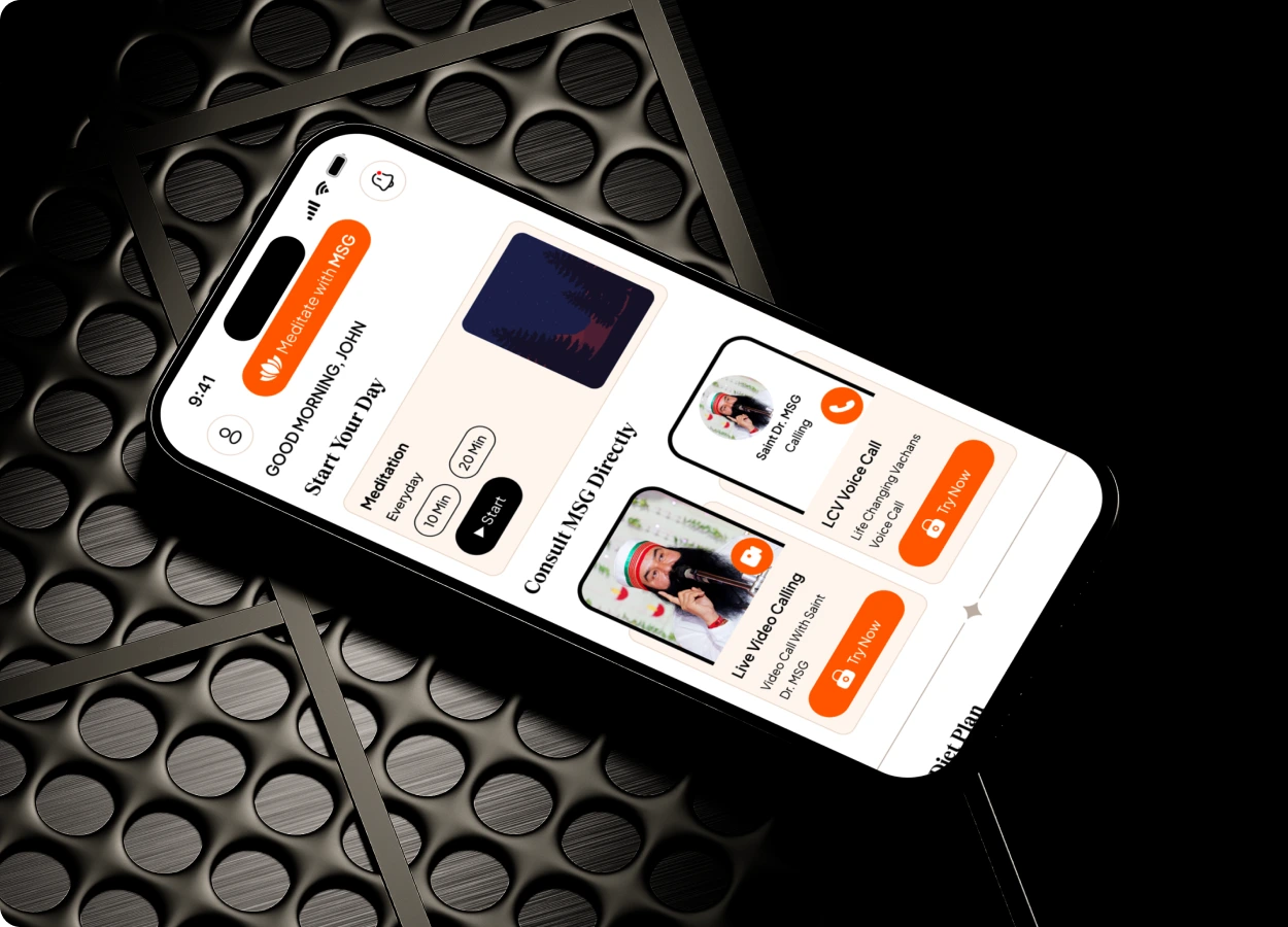
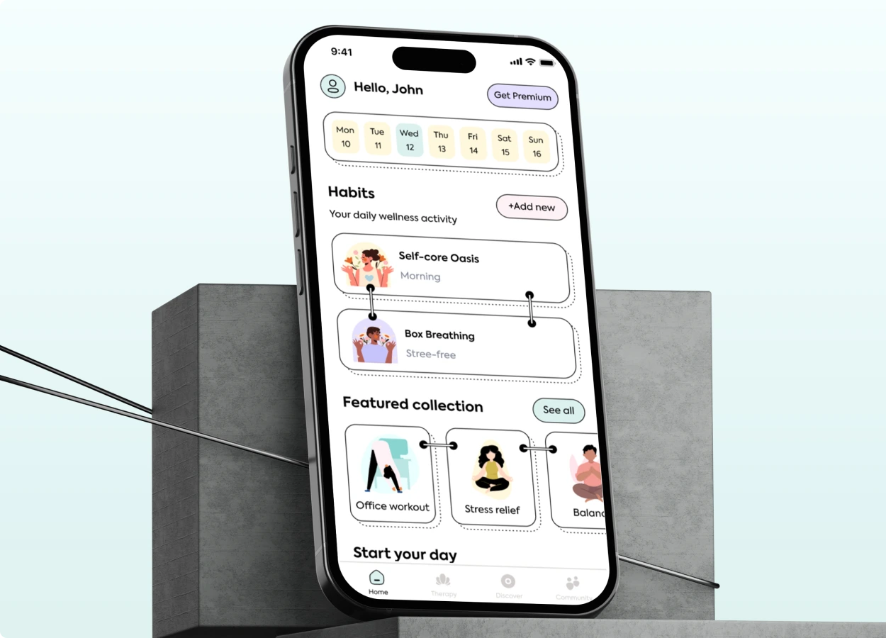
Meditate with MSG
Overview
Challenge: The app’s outdated design and limited features created a disconnect with modern wellness seekers—resulting in low engagement and a lack of emotional connection with users on their spiritual journey.
Solution: I reimagined the experience with a serene, minimal UI and integrated wellness-focused features like guided video/audio calls, lifestyle tracking, and gentle visual cues—creating a space for reflection,
calm, and consistency.
Impact: The redesigned app inspired deeper user connection, increased engagement, and supported holistic well-being—transforming it into a mindful companion for spiritual and lifestyle growth.
- Play Store Meditate with MSG
- Industry Healthcare (e-Commerce)
- Sector Private-India
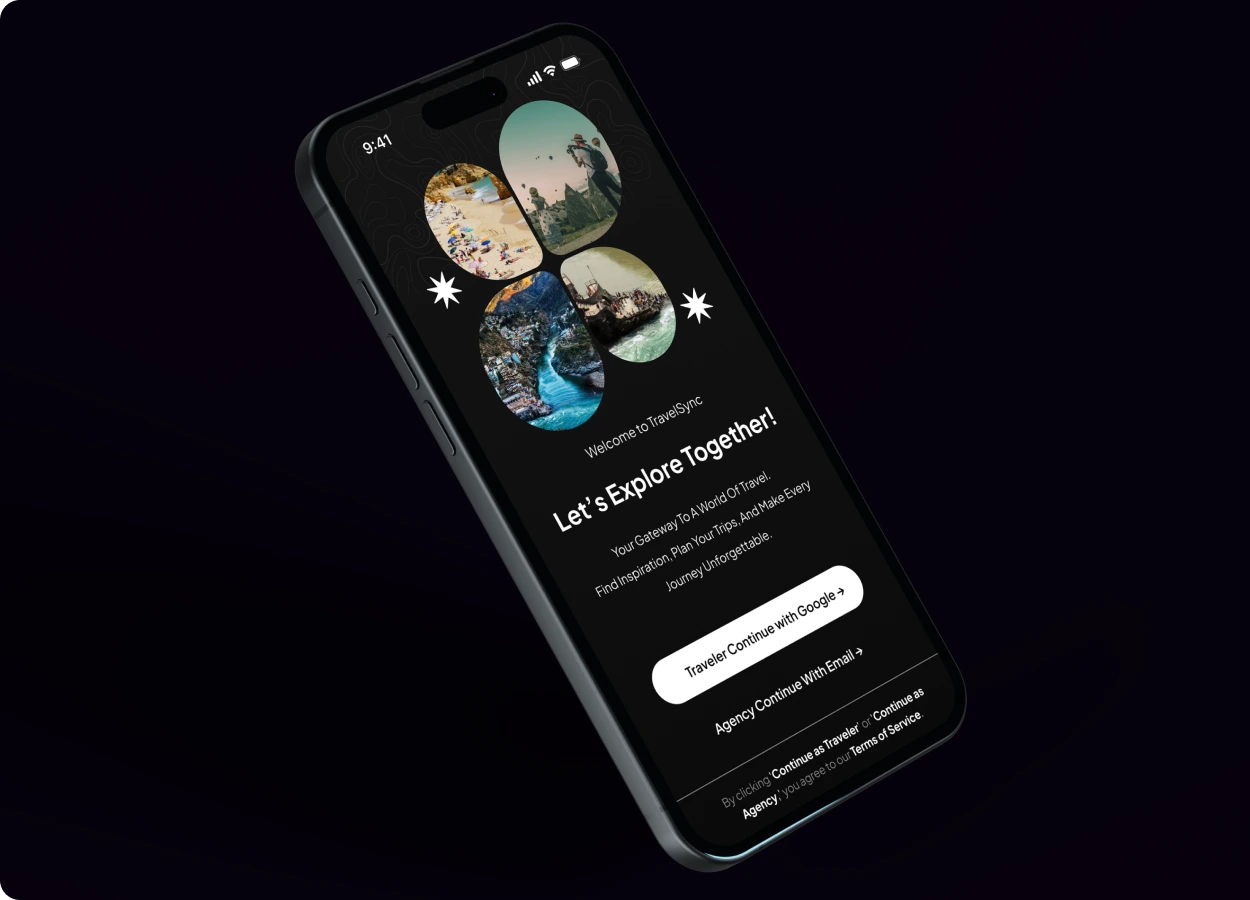

Travelsync
Overview
Challenge: Travelsync’s booking experience lacked visual appeal and intuitive structure, causing confusion during trip planning and leading to user drop-offs before completion.
Solution: I designed a clean, visual-first interface that prioritized trip discovery, simplified booking flows, and added intuitive tools for organizing itineraries—making the experience smoother and more inspiring
for travelers.
Impact: The redesign led to improved booking conversions, reduced user friction, and increased satisfaction—turning planning into an enjoyable and confidence-driven part of the travel journey.
- Play Store Travelsync (In Development)
- Industry Travel (e-Commerce)
- Sector Private-India
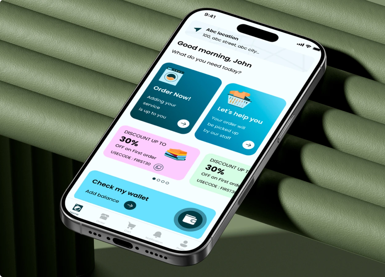
Mister Clean
Overview
Challenge: Mister Clean users experienced confusion and delays while selecting services or scheduling appointments—due to unclear booking flows, minimal feedback, and lack of real-time interaction.
Solution: I redesigned the mobile app with a clean, intuitive interface featuring category-based service filters, dynamic calendar scheduling, and real-time order tracking—creating a fluid, on-demand experience for cleaning
and laundry.
Impact: The refreshed design boosted booking speed, minimized drop-offs, and drove higher conversions and repeat usage—turning everyday chores into an effortless digital experience.
- App Store Mister Clean Customer
- App Store Mister Clean Delivery Partner
- Industry Home Services
- Sector Private – UAE